- Get link
- X
- Other Apps
Featured
- Get link
- X
- Other Apps

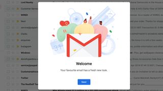
Gmail users now have a chance to try out the new Gmail inbox with a few simple clicks. The Gmail redesign had previously leaked in the lead up to this years Google IO conference, and now the new Gmail is available to non-business users. If you want to try the redesign Gmail inbox, we'll guide you through how to get it.
How to activate the new Gmail inbox

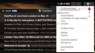
The steps to unlocking the newest version of Gmail are simple. First, you'll need to go to your Gmail inbox. Then, look toward the top right corner of the window, and click on the gear icon. In the drop-down menu, you should see that the first button is new. Press the button that says "Try the new Gmail."
What is the new Gmail?
The new Gmail redesign brings a few new features and a lot more color to your inbox. Among those features are some fantastic quality-of-life changes.
Though subtle, one of the design changes is simply to make the whole page look more uniform in design language. The search bar at the top of your inbox no longer looks out of place, as it now has a transparency that shows through to whatever background you have set.
Though we aren't sure how the new Gmail will allow you to have inbox backgrounds, we can confirm that your existing background will remain intact after the upgrade.
The Primary, Social, and Promotions tabs at the top of your inbox will now fit neatly over the list of emails. Where your emails all reside, Google has added more color, and easy access to attachments. Unread emails have a brighter highlight than before, and selected emails will now be highlighted blue. In the default view, emails with attachments will actually show what those attachments are, and you can open them straight from your inbox without digging into the email.
Google has also added icons for the labels for different email types (Inbox, Starred, Important, Sent, etc). There's even a new type: Snoozed. We'll get into that next.
New Gmail buttons
It's not just design that has changed, as Google has added useful tools and some handy tweaks to make using Gmail better.
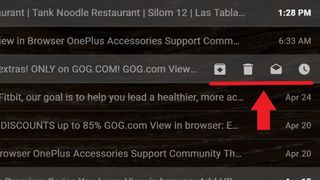
As we mentioned, Google will now allow you to snooze emails, so you'll be notified at a later time when you can respond. There's a new Snooze button to use this feature, and it resides in a convenient place along with buttons for Archive, Delete, and Mark as unread/Mark as read.

Now, if you hover your mouse over an email, the four buttons mentioned will show up at the right side of the email. This will make interacting with items in your inbox much faster, as you don't need to select the email and then move your mouse to the top of the screen where these buttons used to reside. Bulk actions are still available by selecting multiple emails and using the top buttons though.
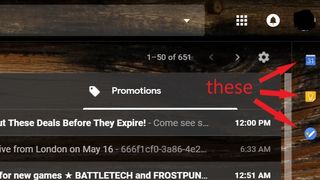
The other new buttons are on the right side of the new Gmail inbox, and offer quick access to your Google Calendar, Google Keep, and Tasks. More tools can be added there as well, such as Asana for Gmail.

Google has also implemented Google Smart Replies. For some emails, above the Reply button, you may see a number of basic responses that you can select to quickly and concisely respond to emails. Just know, they are best for a short answers and thank yous, and they may not show up at the bottom of all emails.
Missing things
One thing we're still waiting for from the new Gmail is the privacy-enhancing Confidential mode. This will offer ways to require passwords or two-factor authentication for recipients to open emails, and it can set expiration dates for those emails.
Another curious absence is the quick link to a uses Google+ profile. Previously, hovering over a users name when you have an email open would create a pop-up with some of their details and a link to their Google+ profile. The pop-up still exists, but Google has seemingly put one more nail in the coffin of Google+.
Hopefully, we'll find out more about the features still to come to the new Gmail at Google IO in May.

Comments
Post a Comment